About Widgets

What are Widgets ?

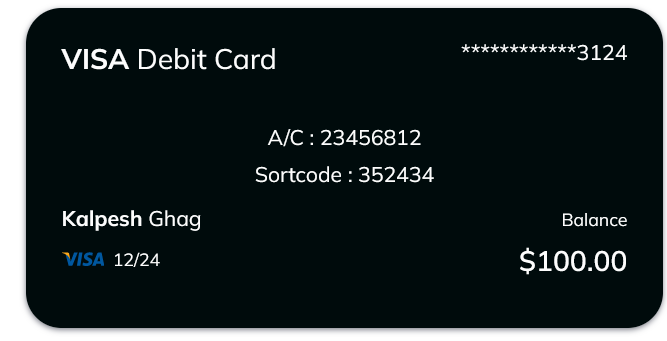
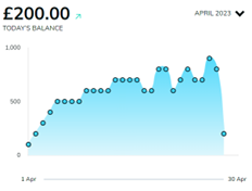
Widgets are “mini-apps” that you drag and drop onto your page canvas that do a particular thing. Examples include card balance widgets, make a payment widgets, account balance chart widgets, spending, statements etc.

In Finxone, you make a page on your application by using a widget from the library and placing it on the page where you want it, and adjusting its settings. You can place lots of widgets on a canvas page and widgets can interact and see each other’s data allowing you to build really cool experiences from different providers visually and easily.

How Widgets Work
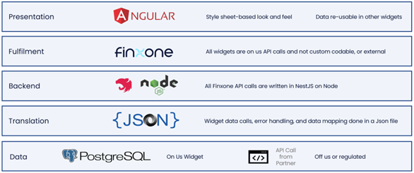
A widget is a full stack mini application that is dropped into a page by drag and drop. They are pre-plumbed into Finxone via private API calls and are close sourced. The architecture allows for regulated and unregulated data to interact seamlessly and in a visual and user-friendly way.

Widgets are always connected to Finxone, and we maintain the code for widgets, and ensure functionality. We add more widgets to our application editors constantly. This gives you an ever expanding set of capabilities into your live application and sandboxes.

How we make widgets

Our widgets are always made by us. We connect every widget to the Finxone main engine that knows exactly the rules of the widget, and what its meant to be used for. To make them easy to use everywhere our widgets have a driver file – very much like your drivers in your computer that teach Finxone how to get or send that data to our partners, or licensed partners.

That way when we add a new market, partner or country its really easy to just update that file, ensuring our widgets work in a wide variety of cases.

if you ever need a widget that we haven’t made yet you can always ask our professional services team to quickly build that widget, and its integration microservice for you.

Types of Widgets
Display Widgets

Display widgets are styling widgets that you can use to customise your application to your specific look and feel. 

Example widgets: Lines and Dividers, Images, Heading and text widgets, and Image carousel 
Onboarding Widgets

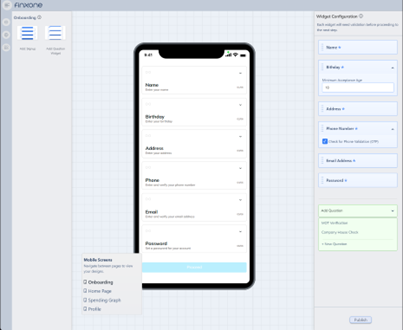
Onboarding widgets allow you to have very specific control about checking user provided data before you decide to accept a user into your application. You can select specific fields that users must pass step by step before they are allowed, and configure limits like age, OTP, etc.

Example: You can use onboarding widgets to do quite complex tasks like check if a person is a director of a company automatically. Simply put the First Name, Last Name widget above the company check question widget, and then 
Question Widgets

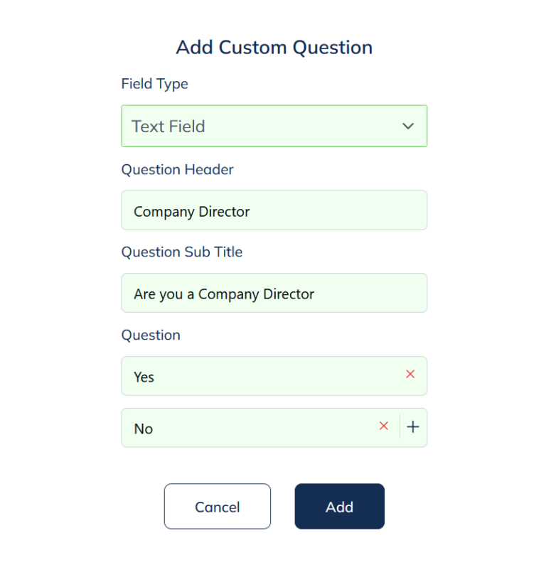
Question widgets allow you to make a question, and add your free entered, or multiple choice, yes/no answers from your user. These questions are important as you can use them to make decisions on your workflows.

You can use question widgets in the onboarding worklfows, or in the advanced workflow editor.

Example You would like a custom experience for a company director, that is different from a normal user.  By placing a question widget that asks if you are a company director above the “Company Director” verification widget, and then connecting the “Yes” answer to the verification widget. You can show the company director check only to users who answered they were company directors. 

Regulated Widgets

Regulated widgets are only allowed on special regulated types of applications. They have very specific onboarding, know your customer and operating requirements. They are only visible if your sanbox is a regulated one. 

Often they are specifically controlled, like making a payment widget enforces the specific regulatory strong customer auth, and know your beneficiary requirements.

Example: A card balance regulated widget automatically gets the real time account balance of that card, and notifies the user (in mobile only) on account movements. The Payments widget executes the authorised steps to add a beneficiary, confirm their account, and then release the payment.

Related articles

Global Styling

Where Creativity Meets Efficiency
Finxone’s Global Styling feature emerges as a beacon of hope for fintech application designers seeking a harmonious design experience.

Read More ⟶